Histogram & Frequency distributions:
A histogram is a bar chart that represents the distribution of data. This groups data into ranges (bins) and shows the frequency (count) of each data points that fall within each bin
Example:
Ages of class
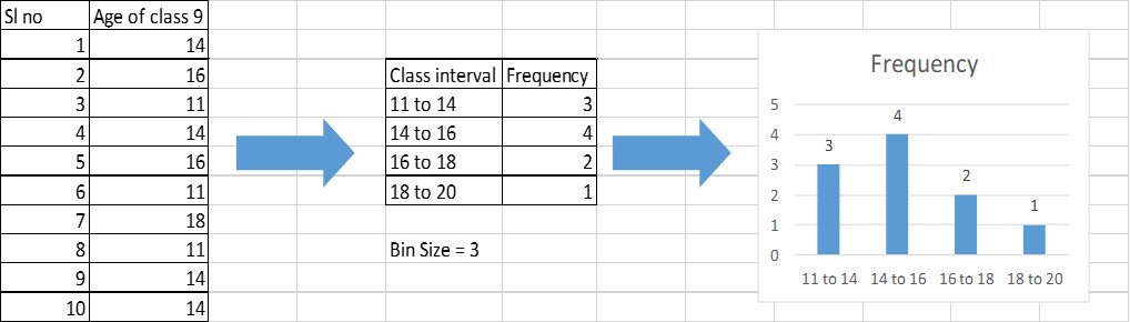
Step 1: set the desired bin size (here we take 3)
Step 2: create a frequency table by counting each elements fall in the class interval range which is based on bins
Step 3: Plot the histogram to check the frequency distribution
Benefits of histograms:
- Identify patterns
- Compare data sets/other columns
- Identify outliers that could skew the data